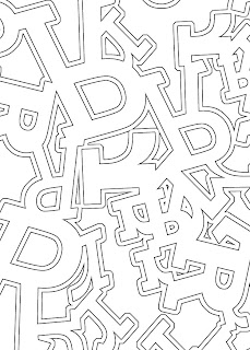
I kept experimenting with the idea of a 'frozen city/snowflake/frosty window' with both upper and lowercase R in this piece. Started to get a better idea of how to take away the 'type-ness' of the letters, and make a pattern out of them.
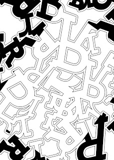
A weird mistake led to a weird image!
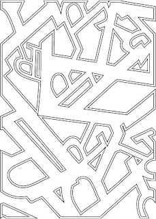
Finally settled on using R and K as my letters, because of the combination of smooth curves and harsh angles. The one above is probably my final image. Started experimenting more with strokes...
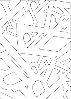
And without strokes...
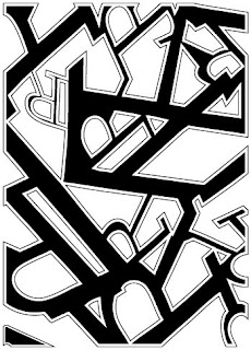
And with black solids in-between. This one could also be my final image. I love how it turned out and can't help but wonder how it would look in white ink on top of a black ink print. Might be a really interesting effect. I can't decide between the two!
Also because I've been bad and haven't posted yet on this blog, I'll share one of my new favorite graphic designers... Scott Hansen. Lots of psychedelic colors and shapes in his posters, and so many neat details. Each one is full of so many layers of texture, which is something I always try to use in my work whenever possible. I could stare at these images for hours!
Here's a link to visit his blog for more goodies.
http://blog.iso50.com/
No comments:
Post a Comment