
Friday, February 25, 2011
information design
Since many of your current projects step into the work of information design, I thought this website may inspire you. Grid/Plane is a west coast design studio that focuses on a lot of information design projects. Their work is clean and refreshing.
 http://www.gridplane.com/html/projects/data-vis/
Tuesday, February 15, 2011

Monday, February 14, 2011

Friday, February 11, 2011
a word of advice...
hi all,
i just got my piece of linoleum cut. it came out fine but I wanted to offer a little advice to those who have never used the laser cutter so that they can get the best results!
1. Make sure you get there like 5-10 minutes early so that it doesn't eat into your time when the operator is formatting your file to be cut, etc.
2. Even if the operator doesn't ask, be sure to specify exactly what you want done. Mine was really nice, except she didn't ask me exactly how I wanted my design to be cut out. Having never used a laser cutter, I just figured there was only one possible way for my block to come out. Now, instead of my whole pattern being dug out, the laser only cut out the outlines. Basically my block has little lines etched into it and I'm hoping that I can still ink it without the ink getting into the grooves.
I hope that makes sense! Good luck!
ruani
Thursday, February 10, 2011

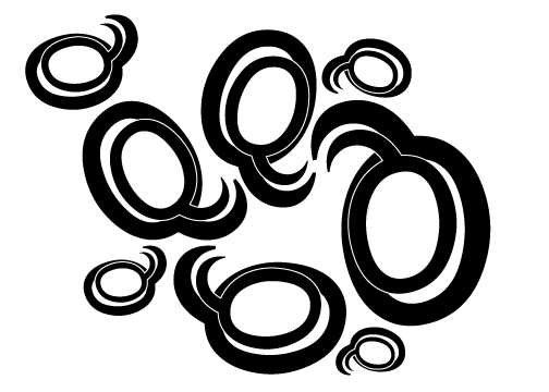
Claire Niebergall - Final Designs

I kept experimenting with the idea of a 'frozen city/snowflake/frosty window' with both upper and lowercase R in this piece. Started to get a better idea of how to take away the 'type-ness' of the letters, and make a pattern out of them.

A weird mistake led to a weird image!

Finally settled on using R and K as my letters, because of the combination of smooth curves and harsh angles. The one above is probably my final image. Started experimenting more with strokes...

And without strokes...

And with black solids in-between. This one could also be my final image. I love how it turned out and can't help but wonder how it would look in white ink on top of a black ink print. Might be a really interesting effect. I can't decide between the two!
Also because I've been bad and haven't posted yet on this blog, I'll share one of my new favorite graphic designers... Scott Hansen. Lots of psychedelic colors and shapes in his posters, and so many neat details. Each one is full of so many layers of texture, which is something I always try to use in my work whenever possible. I could stare at these images for hours!

Here's a link to visit his blog for more goodies.
http://blog.iso50.com/
Final Versions

 still going with the idea of freshly fallen snow. different renditions of the same idea. the white on black have .50 strike. the black on white have .25 stroke.


Tuesday, February 8, 2011
these are in reverse order
I started playing with the idea of bare trees that I talked about last week, and I wanted to work with the archer "V" and gotham "r" forms. In the end, I thought it would be interesting to combine both of those ideas. The pattern made of the v's evokes the gradual buildup of snowfall, which I really appreciate because it doesn't seem to do that in a literal way. I like the form created by the r's , but I am not sure if it says "tree" in a too literal way.
disappointed to have missed the critique today! i would really appreciate any suggestions =)


These bottom ones I did are also in reverse order. I wanted to try to use the r form to create a pattern similar to the v one. The softeness of the r emulated snowfall to me in a different way and then the bottoms of my pattern reminded me of icicles so I decide to go and see what that would look like.


I


Works in Progress


These are some of my current works in progress. I've been for the most part sticking with trying to create a flow in the pattern. I think I like the bottom left one the best and will continue to iterate on that.
sameness / alex fuller + gabe usadel
These page spread from the book, "sameness," are visually interesting example of form and line with limited shapes and colors. Alex fuller also has another book, "Levels and degrees of light," that you may also enjoy while working on this current project. View the links to see more images.
http://billfick.com/
http://alexfuller.com/


http://billfick.com/
http://alexfuller.com/
Saturday, February 5, 2011
a logo you might recognize! (from walnut street)

Although this might not be the coolest logo in the world it still reminded me of this class and sending a message with just letter forms. Although we are not allowed to use representative elements in our compositions (like the R's legs here) I still think that this designer chose a good font to represent speed. For example I think the serifs on the top left of the P and the R are perfect. My word was velocity for the last project so this logo really stood out to me.
Tuesday, February 1, 2011
the work of Evelin Kasikov


Olly Moss

A great deal of what Moss does are witty riffs on popular culture, as can be seen in the series of posters called "Films in Black and Red" in which he reimagines movie posters from classic or much-viewed films using only black, red, and white, or his "mash-ups" of favorite video games with classic Penguin paperback book covers in the series "Video Game Classics". He employs an uncomplicated style which relies heavily on grouping to let his natural wit shine through.
I know his popularity has been rising in the last few years and it is likely that all of us in the class are familiar with at least some of his work, whether we knew it at the time we encountered it or not. Perhaps the most surprising place I saw it was in a street market in Manila this past holiday break, where, among the locally-made goods and foodstuffs, was a Filipino man conversing with passers-by wearing a T-shirt with Moss's "Now Panic and Freak Out" parody design loudly and stylishly proclaimed in Gill Sans.
See a nice representative collection of Olly Moss's work on his personal website.
And his recent take on posters for the original Star Wars trilogy here.
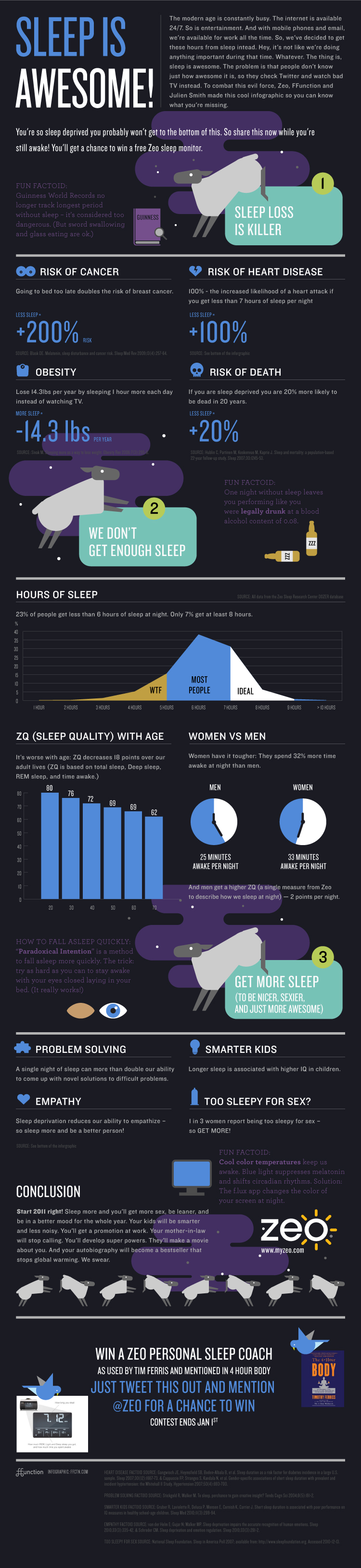
Infographic
http://images.fastcompany.com/upload/zeo-Sleep-Infographic-FFunction.jpg
I saw the above infographic about sleep last night and think it displays a lot of the concepts we are exploring in designing with type. The use of different typefaces, scale, hierarchy, and organization really help in conveying the information.
I saw the above infographic about sleep last night and think it displays a lot of the concepts we are exploring in designing with type. The use of different typefaces, scale, hierarchy, and organization really help in conveying the information.
Subscribe to:
Comments (Atom)