Tuesday, April 19, 2011
new colors
okay so i went on illustrator and matched the colors even better
the green is 318C
the blue is 2905C
the orange is 179C
this is also helpful for getting the swatch library: http://graphicdesign.spokanefalls.edu/tutorials/tech/pantone_colors/pantone.htm
Printing Instructions
Here are the instructions for printing your layouts front and back.
First, make a PDF file with both of your pages (one should have the back and front, the other should be the 2 page spread). You can do this in InDesign, or you can combine multiple PDF's in Acrobat (just choose Combine -> Merge files into a single PDF). The way I did mine, the first page of the PDF had what was supposed to be the back page on the left side, and what was supposed to be front page on the right side. The second page in the PDF had the 2-page spread.
If your PDF is in this arrangement, you need to rotate the second page so it is printed out correctly. Open it up in Acrobat, go to the second page and choose Document -> Rotate Pages. and for Direction choose 180 Degrees. This will flip it the correct way.
Now go to File -> Properties and click on the Advanced Tab. You'll see a drop down next to DuplexMode. Choose Duplex Flip Long Edge (that worked for me).
Go to Page Setup, choose ADDM-7760GX as your printer and make it Tabloid size.
That should be it!
Pantone colors and font
The pantone colors are:
166 C
290 C
388 C
The font is 10 pt Univers. I think it's a font you need to activate with the type client.
better late than never
here are my layouts. keeping it graphic. my type reminds me of bones. maybe add some grungy textures? starting to like it, but still needs work.
front/ back

inside

front/ back

inside

Monday, April 18, 2011
New version of 2 page spread

Trisha/the rest of the class:
Is this cool? what else can I add to it? I kind of gave up on my last idea. It wasn't turning out cool like I had promised.
Sunday, April 17, 2011


Friday, April 15, 2011
Layout In Progress
Front and Back

Inside Spread

I'm thinking of something to write instead of just using the alphabet in the inside pages (hopefully that will make it more interesting)

Inside Spread

I'm thinking of something to write instead of just using the alphabet in the inside pages (hopefully that will make it more interesting)
VERY in progress

So I kinda had to start over yesterday because I didn't like what I made but I plan on making a cool pattern out of my letter forms and the texture of the blinds they are made out of. Here is the beginning of that idea. It will look cool when I'm finished I promise!
Thursday, April 14, 2011

Monday, April 11, 2011
Sunday, April 10, 2011
Keith Scharwath
I was reading GOOD magazine online and liked their most recent cover so I looked up the designer. Really great stuff in terms of color and typography.
http://scharwath.com/
http://scharwath.com/
Thursday, March 31, 2011

Thursday, March 24, 2011

Tuesday, March 22, 2011
inspiration
Check out these really great energy conservation posters that are up in Japan at the moment.
http://pinktentacle.com/2011/03/electricity-conservation-posters/
http://pinktentacle.com/2011/03/electricity-conservation-posters/
Monday, March 21, 2011
album cover inspiration website
Here are some sweet inspirations that I found on the AIGA website. There is even a collection for best album cover designs!
http://designarchives.aiga.org/#/collections
Saturday, March 19, 2011
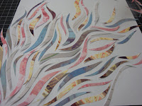
record cover evolved
this is just a little progress on my ideas. i took all my pictures of urban decay type stuff (old signs, graffiti, boarded up door ways, chipping paint) and applied pink, yellow, light green, and bluish filters (i was thinking fun, pretty colors). i still wanted some sort of tension like pretty/ugly, fun/dark so i printed the photos and hand cut them into these swirly shapes then reassembled them on the paper. it has a fantastical quality from a far, but if you look up close you can see the urban elements in each of the cut outs too. sad part is, i didn't want to make this permanent patially because i didn't know which of the ones below i should do (the whole cover covered or only parts).


Thursday, March 17, 2011
record cover idea

still very rough these are the sorts of elements i'd like to include...trying to create something that is both cute/fun and dark at the same time.
inspirations: wall papers of dan funderburgh, urban decay, amy ruppel's illustrations, floral prints
you can't really see the pattern, but they are silhouettes of knives, grenades, and hearts.


Album Cover In Progress

I scanned in a drawing I did based on Aboriginal painting. I definitely need another element, but I'm happy with this as a start. The strokes are a little messed up when I look at the jpeg/pdf...
Tuesday, March 15, 2011
project 3 inspirations
Monday, March 7, 2011
Tuesday, March 1, 2011
LIght Painting: Mapping Wi-Fi Strength Through Photography
Poking around the internet for infographics last night, I found this interesting video documenting a photography project which uses long-exposure photography, a wi-fi radio and a life-size meter created by the artists to map invisible wi-fi signals onto real landscapes. The end product is a set of photos which show a cross-section of the invisible field of signals. It's not quite graphic design, but I appreciated the out-of-the-box thinking in how the artists decided to show the information. The photos give a sense of the technology and data that surrounds us today, even if we can't readily perceive it with our five senses.
Immaterials: Light painting WiFi from Timo on Vimeo.
Friday, February 25, 2011
information design
Since many of your current projects step into the work of information design, I thought this website may inspire you. Grid/Plane is a west coast design studio that focuses on a lot of information design projects. Their work is clean and refreshing.
 http://www.gridplane.com/html/projects/data-vis/

Tuesday, February 15, 2011

Monday, February 14, 2011

Friday, February 11, 2011
a word of advice...
hi all,
i just got my piece of linoleum cut. it came out fine but I wanted to offer a little advice to those who have never used the laser cutter so that they can get the best results!
1. Make sure you get there like 5-10 minutes early so that it doesn't eat into your time when the operator is formatting your file to be cut, etc.
2. Even if the operator doesn't ask, be sure to specify exactly what you want done. Mine was really nice, except she didn't ask me exactly how I wanted my design to be cut out. Having never used a laser cutter, I just figured there was only one possible way for my block to come out. Now, instead of my whole pattern being dug out, the laser only cut out the outlines. Basically my block has little lines etched into it and I'm hoping that I can still ink it without the ink getting into the grooves.
I hope that makes sense! Good luck!
ruani
Thursday, February 10, 2011

Claire Niebergall - Final Designs

I kept experimenting with the idea of a 'frozen city/snowflake/frosty window' with both upper and lowercase R in this piece. Started to get a better idea of how to take away the 'type-ness' of the letters, and make a pattern out of them.

A weird mistake led to a weird image!

Finally settled on using R and K as my letters, because of the combination of smooth curves and harsh angles. The one above is probably my final image. Started experimenting more with strokes...

And without strokes...

And with black solids in-between. This one could also be my final image. I love how it turned out and can't help but wonder how it would look in white ink on top of a black ink print. Might be a really interesting effect. I can't decide between the two!
Also because I've been bad and haven't posted yet on this blog, I'll share one of my new favorite graphic designers... Scott Hansen. Lots of psychedelic colors and shapes in his posters, and so many neat details. Each one is full of so many layers of texture, which is something I always try to use in my work whenever possible. I could stare at these images for hours!

Here's a link to visit his blog for more goodies.
http://blog.iso50.com/
Final Versions

 still going with the idea of freshly fallen snow. different renditions of the same idea. the white on black have .50 strike. the black on white have .25 stroke.


Tuesday, February 8, 2011
these are in reverse order
I started playing with the idea of bare trees that I talked about last week, and I wanted to work with the archer "V" and gotham "r" forms. In the end, I thought it would be interesting to combine both of those ideas. The pattern made of the v's evokes the gradual buildup of snowfall, which I really appreciate because it doesn't seem to do that in a literal way. I like the form created by the r's , but I am not sure if it says "tree" in a too literal way.
disappointed to have missed the critique today! i would really appreciate any suggestions =)


These bottom ones I did are also in reverse order. I wanted to try to use the r form to create a pattern similar to the v one. The softeness of the r emulated snowfall to me in a different way and then the bottoms of my pattern reminded me of icicles so I decide to go and see what that would look like.


I


Subscribe to:
Comments (Atom)