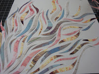
this is just a little progress on my ideas. i took all my pictures of urban decay type stuff (old signs, graffiti, boarded up door ways, chipping paint) and applied pink, yellow, light green, and bluish filters (i was thinking fun, pretty colors). i still wanted some sort of tension like pretty/ugly, fun/dark so i printed the photos and hand cut them into these swirly shapes then reassembled them on the paper. it has a fantastical quality from a far, but if you look up close you can see the urban elements in each of the cut outs too. sad part is, i didn't want to make this permanent patially because i didn't know which of the ones below i should do (the whole cover covered or only parts).
This blog will document dialog outside the class discussions. This course places emphasis on the elements of graphic design and principles of visual organization for the purpose of communicating a message to a particular audience. The course explores shape, color, and communication; visual hierarchy; word/image relationships and integration; typography; symbol design; and visual rhetoric.
- http://www.aiga.org
- http://www.designobserver.com/
- http://www.graphicdesigndictionary.com
- http://www.hillmancurtis.com/index.php?/film/view/latest_films/
- http://www.lynda.com/
- http://www.nonperishable.com/
- http://www.thedesignencyclopedia.org
- http://www.typophile.com/
- http://www.underconsideration.com/speakup/
No comments:
Post a Comment