This blog will document dialog outside the class discussions. This course places emphasis on the elements of graphic design and principles of visual organization for the purpose of communicating a message to a particular audience. The course explores shape, color, and communication; visual hierarchy; word/image relationships and integration; typography; symbol design; and visual rhetoric.
- http://www.aiga.org
- http://www.designobserver.com/
- http://www.graphicdesigndictionary.com
- http://www.hillmancurtis.com/index.php?/film/view/latest_films/
- http://www.lynda.com/
- http://www.nonperishable.com/
- http://www.thedesignencyclopedia.org
- http://www.typophile.com/
- http://www.underconsideration.com/speakup/
Thursday, March 31, 2011
Thursday, March 24, 2011
Tuesday, March 22, 2011
inspiration
Check out these really great energy conservation posters that are up in Japan at the moment.
http://pinktentacle.com/2011/03/electricity-conservation-posters/
http://pinktentacle.com/2011/03/electricity-conservation-posters/
Monday, March 21, 2011
album cover inspiration website
Here are some sweet inspirations that I found on the AIGA website. There is even a collection for best album cover designs!
http://designarchives.aiga.org/#/collections
Saturday, March 19, 2011
record cover evolved
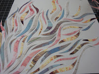
this is just a little progress on my ideas. i took all my pictures of urban decay type stuff (old signs, graffiti, boarded up door ways, chipping paint) and applied pink, yellow, light green, and bluish filters (i was thinking fun, pretty colors). i still wanted some sort of tension like pretty/ugly, fun/dark so i printed the photos and hand cut them into these swirly shapes then reassembled them on the paper. it has a fantastical quality from a far, but if you look up close you can see the urban elements in each of the cut outs too. sad part is, i didn't want to make this permanent patially because i didn't know which of the ones below i should do (the whole cover covered or only parts).


Thursday, March 17, 2011
record cover idea

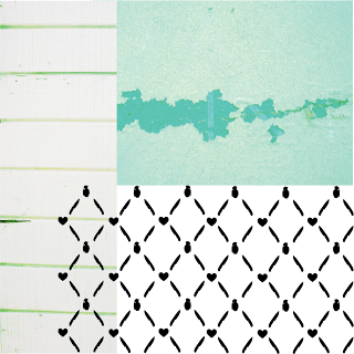
still very rough these are the sorts of elements i'd like to include...trying to create something that is both cute/fun and dark at the same time.
inspirations: wall papers of dan funderburgh, urban decay, amy ruppel's illustrations, floral prints
you can't really see the pattern, but they are silhouettes of knives, grenades, and hearts.
Album Cover In Progress
Tuesday, March 15, 2011
project 3 inspirations
Monday, March 7, 2011
Tuesday, March 1, 2011
LIght Painting: Mapping Wi-Fi Strength Through Photography
Poking around the internet for infographics last night, I found this interesting video documenting a photography project which uses long-exposure photography, a wi-fi radio and a life-size meter created by the artists to map invisible wi-fi signals onto real landscapes. The end product is a set of photos which show a cross-section of the invisible field of signals. It's not quite graphic design, but I appreciated the out-of-the-box thinking in how the artists decided to show the information. The photos give a sense of the technology and data that surrounds us today, even if we can't readily perceive it with our five senses.
Immaterials: Light painting WiFi from Timo on Vimeo.
Subscribe to:
Comments (Atom)


