This blog will document dialog outside the class discussions. This course places emphasis on the elements of graphic design and principles of visual organization for the purpose of communicating a message to a particular audience. The course explores shape, color, and communication; visual hierarchy; word/image relationships and integration; typography; symbol design; and visual rhetoric.
- http://www.aiga.org
- http://www.designobserver.com/
- http://www.graphicdesigndictionary.com
- http://www.hillmancurtis.com/index.php?/film/view/latest_films/
- http://www.lynda.com/
- http://www.nonperishable.com/
- http://www.thedesignencyclopedia.org
- http://www.typophile.com/
- http://www.underconsideration.com/speakup/
Monday, January 31, 2011
amazing patterns out of letters
there are too many wonderful images for me to put them all here but check out this portfolio of a japan based swedish designer for some amazing patterns made of single letters! the artist prints the patterns on textiles and creates buttons and pillows from them. he calls the collection "scriptures".
Get thee to a letterpress

Okay so she may have used silkscreen...but still. These are some images from Sister Corita, a nun and graphic designer from the 60s and 70s. She made a lot of type-based work to encourage pacifism, love and social equality in that era.
http://www.google.com/images?q=sister+corita&oe=utf-8&rls=org.mozilla:en-US:official&client=firefox-a&um=1&hl=en&ie=UTF-8&source=og&sa=N&tab=wi&biw=1280&bih=839
Thursday, January 27, 2011
Band Logos
Tuesday, January 25, 2011
more type

I ran into this poster in the Jaffe building and I was reminded of our type project. I think that it is interesting that we don't have to see the whole form of individual letters to know what word is being spelled. Also, I like how the horizontal type is layered over perpendicular black "monster" letters.
Monday, January 24, 2011
type admitted to MOMA's architecture + design collection
check out this article in today's nyt about digital typefaces
http://www.nytimes.com/2011/01/24/arts/24iht-design24.html?scp=1&sq=typography&st=cse
http://www.nytimes.com/2011/01/24/arts/24iht-design24.html?scp=1&sq=typography&st=cse
Saturday, January 22, 2011
negative/positive space
Thursday, January 20, 2011
Logos and Type
Although we observe many different logos and brand images everyday, I found myself interested in two particular logos for a store and bank which were located across the street from each other. What made these specifically catch my eye was the difference in the logos and how they communicated their individual brands.

The placement of the P in the logo is noticeable but relatively subtle. The circular design definitely seems to be going for a more modern, stylish, "fun" look which I suppose is what the store intends to be.

This, in contrast, is an arguably more boring but perhaps more traditional look. The B appears more prominent and the vertical bars instill a sense of stability, which is what a bank probably wants.
I'm sure much more could be said about these logos and there are sure to be better examples to be found to illustrate how type is used in logos to achieve different goals. I think what made these stand out to me was there proximity to one another and how quickly I could distinguish between what they were trying to represent.

The placement of the P in the logo is noticeable but relatively subtle. The circular design definitely seems to be going for a more modern, stylish, "fun" look which I suppose is what the store intends to be.

This, in contrast, is an arguably more boring but perhaps more traditional look. The B appears more prominent and the vertical bars instill a sense of stability, which is what a bank probably wants.
I'm sure much more could be said about these logos and there are sure to be better examples to be found to illustrate how type is used in logos to achieve different goals. I think what made these stand out to me was there proximity to one another and how quickly I could distinguish between what they were trying to represent.
Wednesday, January 19, 2011
 heya!
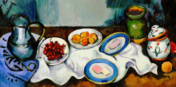
heya!this is google's latest logo. it's an homage to cezanne for his 172nd birthday--or some number like that. if you google useless information as much as i do, then you've probably already seen this... but i thought i'd put it up anyway cuz i think it's pretty awesome.
also for more logos you can click on http://www.google.com/logos/logos10-1.html
Tuesday, January 18, 2011
David Carson
Hi guys,
Some of you may be familiar with David Carson because he gave a lecture at Penn last semester. He is a surfer-turned-graphic-designer and has some pretty amazing stuff on his website/blog.
Here it is: http://www.davidcarsondesign.com/
Some of you may be familiar with David Carson because he gave a lecture at Penn last semester. He is a surfer-turned-graphic-designer and has some pretty amazing stuff on his website/blog.
Here it is: http://www.davidcarsondesign.com/
inspiration for workshop 2
hey all,
can across a really cool "pintrest" page (which is like a digg or stumbleupon, i guess) which collects a bunch of beautiful typographic images. while most of them use words, the way many of the images arrange letters and play with their shapes might make it helpful for thinking about workshop 2 =) click here---> Typography Love
here are a few i thought were awesome (the last one reminds me of the more physical nature of the woodblock pieces we are using):


Monday, January 17, 2011
Philly Mural
 I passed this graffiti in center city and thought of this class. I like how it looks random and sporadic on the wall while feeling spatially balanced at the same time.
Subscribe to:
Comments (Atom)


